wiTab Component
The tab-component is based on Bootstrap's tabs.
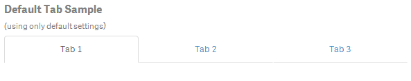
Basic Example
Html:
<wi-tab>
    <tabset>
        <tab heading="Tab 1"></tab>
        <tab heading="Tab 2"></tab>
        <tab heading="Tab 3"></tab>
    </tabset>
</wi-tab>
Result:
Options
Note: There is no need to surround wi-tab with wi-bootstrap, the Boostrap will be automatically made available if you declare wi-tab!
tabset
| Property | Description |
|---|---|
vertical |
Defines whether tabs appear vertically stacked. Defaults: false |
justified |
Defines whether tabs fill the container and have a consistent width. Defaults: false |
type |
Defines the navigation type. Possible values are ' tabs' and 'pills'Defaults: ' tabs' |
tab
| Property | Description |
|---|---|
headingor <tab-heading> |
Heading text or Html markup. |
active |
Defines whether the tab is currently selected. Defaults: false |
disabled |
Defines whether the tab is clickable and can be activated. Defaults: false |
select() |
An optional expression called when tab is activated. |
deselect() |
An optional expression called when tab is deactivated. |
More Examples
Vertical Tab
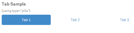
Type Pills
Html:
<wi-tab>
    <tabset type="pills">
        <tab heading="Tab 1"></tab>
        <tab heading="Tab 2"></tab>
        <tab heading="Tab 3"></tab>
    </tabset>
</wi-tab>
Result: