wiMiniChart Component
The Minichart directive allows you to integrate several minicharts (bar, sparkline, bulletchart, etc.) into your qWidgets. The implementation is based on the excellent jQuery-Sparklines library.
Basic Example
<wi-minichart
    type="line"
    data="10,66,13,58"
    width="100px">
</wi-minichart>
Results into

Usage
wiMinichart can be either used as an element or as an attribute:
Element:
<wi-minichart ... />Attribute:
<div wi-minichart ... />Minichart-Types
Minicharts are available in the following types:
- Line (default)
- Bar
- Tristate
- Discrete
- Bullet
- Pie
- Box
Usage
You can implement several minicharts within a single qWidget. Common usage scenarios:
- Use a minichart in the background of KPI-tile
- Use minicharts as inline-charts for tables
Common Chart Options
The following options can be set for most of the chart types:
| Option | Description |
|---|---|
type |
One of the following values: line, bar, tristate, discrete, bullet, pie, box |
width |
Width of the chart - Defaults to 'auto' - May be any valid css width - 1.5em, 20px, etc (using a number without a unit specifier won't do what you want) - This option does nothing for bar and tristate chars (see barWidth) |
height |
Height of the chart - Defaults to 'auto' (line height of the containing tag) |
line-color |
Used by line and discrete charts to specify the colour of the line drawn as a CSS values string |
fill-color |
Specify the colour used to fill the area under the graph as a CSS value. Set to false to disable fill |
chart-range-min |
Specify the minimum value to use for the range of Y values of the chart - Defaults to the minimum value supplied |
chart-range-max |
Specify the maximum value to use for the range of Y values of the chart - Defaults to the maximum value supplied |
opacity |
Opacity of the chart, added to the functionality of jQuery-Sparklines, default: 1, 50%-opacity would be defined with opacity="0.5" |
Linechart-Options
Line charts are the default chart type, but to specify the type explicitly set an option called "type" to "line".
| Option | Description |
|---|---|
default-pixels-per-value |
Defaults to 3 pixels of width for each value in the chart |
spot-color |
The CSS colour of the marker displayed for the mimum value. Set to false or an empty string to hide it |
min-spot-color |
The CSS colour of the marker displayed for the mimum value. Set to false or an empty string to hide it |
max-spot-color |
The CSS colour of the marker displayed for the maximum value. Set to false or an empty string to hide it |
spot-radius |
Radius of all spot markers, In pixels (default: 1.5) - Integer |
value-spots |
Specifies which points to draw spots on, and with which colour. Accepts a range. For example, to render green spots on all values less than 50 and red on values higher use {':49': 'green, '50:': 'red'} |
highlight-spot-color |
Specifies a colour for the spot that appears on a value when moused over. Set to null to disable. |
highlight-line-color |
Specifies a colour for the vertical line that appears through a value when moused over. Set to null to disable. |
line-width |
In pixels (default: 1) - Integer |
normal-range-min |
|
normal-range-max |
|
draw-normal-on-top |
By default the normal range is drawn behind the fill area of the chart. Setting this option to true causes it to be drawn over the top of the fill area |
xvalues |
|
chart-range-clip |
|
chart-range-min-x |
Specifies the minimum value to use for the X value of the chart |
chart-range-min-y |
Specifies the maximum value to use for the X value of the chart |
Bar Chart Options
Set the "type" option to "bar" to generate bar charts. Values can be omitted by using the "null" value instead of a number.
| Option | Description |
|---|---|
bar-color |
CSS color used for postive values |
neg-bar-color |
CSS color used for negative values |
zero-color |
CSS color used for values equal to zero |
null-color |
CSS color used for values equal to null - By default null values are omitted entirely, but setting this adds a thin marker for the entry - This can be useful if your chart is pretty sparse; perhaps try setting it to a light gray or something equally unobtrusive |
bar-width |
Width of each bar, in pixels (integer) |
bar-spacing |
Space between each bar, in pixels (integer) |
zero-axis |
Centers the y-axis at zero if true (default) |
color-map |
A range map to map specific values to selected colours. For example if you want all values of -2 to appear yellow, use colorMap: { '-2': '#ff0' }. As of version 1.5 you may also pass an array of values here instead of a mapping to specifiy a color for each individual bar. For example if your chart has three values 1,3,1 you can set colorMap=["red", "green", "blue"] As of version 2.0, objects will be automatically be converted to range maps so you can specify colours for a range of values |
stacked-bar-color |
An array of colours to use for stacked bar charts. The first series will use the first value in the array, the second series will use the second, etc. New in 2.0 |
Advanced Bar Chart Examples
Bar Chart with opacity Ideal to be used in the background of tiles, etc.
<wi-minichart
    type="bar"
    data="-22,23,66,19,58,-99,99,23,26,80,33,55"
    width="100px"
    height="70px"
    bar-color="#cccccc"
    neg-bar-color="#ff0000"
    bar-width="15px"
    opacity="0.4"
    bar-spacing="3px"
    zero-axis="false">
</wi-minichart>
Results into: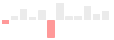
Tristate Chart Options
Tri-state charts are useful to show win-lose-draw information, such as the SF Giants recent game results at the top of the page. You can also use the colorMap option to use different colours for different values, or for arbitrary positions in the chart.
Set the "type" option to "tristate" to generate tristate charts.
| Option | Description |
|---|---|
pos-bar-color |
CSS color for positive (win) values |
neg-bar-color |
CSS color for negative (lose) values |
zero-bar-color |
CSS color for zero (draw) values |
bar-width |
Width of each bar, in pixels (integer) |
bar-spacing |
Space between each bar, in pixels (integer) |
color-map |
A range map to map specific values to selected colours. For example if you want all values of -2 to appear yellow, use colorMap: { '-2': '#ff0' }. As of version 1.5 you may also pass an array of values here instead of a mapping to specifiy a color for each individual bar. For example if your chart has three values 1,3,1 you can set colorMap=["red", "green", "blue"] As of version 2.0, objects will be automatically be converted to range maps so you can specify colours for a range of values |
Discrete Chart Options
Discrete charts provide a separated thin vertical line for each value. Set the "type" option to "discrete" to generate discrete charts.
| Option | Description |
|---|---|
line-height |
Height of each line in pixels - Defaults to 30% of the graph height |
threshold-value |
Values less than this value will be drawn using thresholdColor instead of lineColor |
threshold-color |
Colur to use in combination with thresholdValue |
Bullet Chart Options
Set the "type" option to "bullet" to generate bullet graphs.
| Option | Description |
|---|---|
target-color |
The CSS color of the vertical target marker |
target-width |
The width of the target marker in pixels (integer) |
performance-color |
The CSS color of the performance measure horizontal bar |
range-colors |
Colors to use for each qualitative range background color - This must be a javascript array. eg ['red','green', '#22f'] |
Pie Chart Options
Set the "type" option to "pie" to generate pie charts.
| Option | Description |
|---|---|
slice-colors |
An array of CSS colors to use for pie slices |
offset |
Angle in degrees to offset the first slice - Try -90 or +90 |
border-width |
Width of the border to draw around the whole pie chart, in pixels. Defaults to 0 (no border) |
border-color |
CSS color to use to draw the pie border. Defaults to #000 |
Box Chart Options
Set the "type" option to "box" to generate box plots.
| Option | Description |
|---|---|
raw |
If set to false (default) then the values supplied are used to caculate the box data points for you. If true then you must pre-calculate the points (see below) |
show-outliers |
If true (default) then outliers (values > 1.5x the IQR) are marked with circles and the whiskers are placed at Q1 and Q3 instead of the least and greatest value |
outlierIQR |
Set the inter-quartile range multipler used to calculate values that qualify as an outlier - Defaults to 1.5 |
box-line-color |
CSS line color used to outline the box |
box-fill-color |
CSS fill color used for the box |
whisker-color |
CSS colour used to draw the whiskers |
outlier-line-color |
|
outlier-fill-color |
CSS color used to fill the outlier circles |
spot-radius |
Radius in pixels to draw the outlier circles |
median-color |
CSS color used to draw the median line |
target |
If set to a value, then a small crosshair is drawn at that point to represent a target value |
target-color |
CSS color used to draw the target crosshair, if set |
min-value |
If minvalue and maxvalue are set then the scale of the plot is fixed. By default minValue and maxValue are deduced from the values supplied |
max-value |
See minValue |
Have a look at http://omnipotent.net/jquery.sparkline/#line Note the following behavior when using parameters in tags:
linebecomesline=""lineWidthbecomesline-width=""chartRangeMinXbecomeschart-range-min-x=""
etc
Further Documentation & Copyright
For a full list of options, please visit http://omnipotent.net/jquery.sparkline/