wiSlider Component
Use the wiSlider compoonent to manipulate the numeric values of one or two Qlik Sense variables with a graphical slider.
Basic Example
Html:
<wi-slider
min="0"
max="100"
step="10"
bind-qs-var="vSliderResult"
>
</wi-slider>
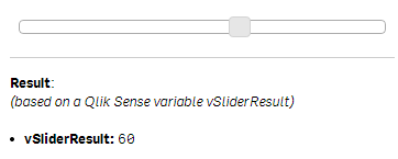
<hr />
<b>Result</b>:<br/>
<i>(based on a Qlik Sense variable vSliderResult)</i><br/><br/>
<ui>
<li><b>vSliderResult:</b> {{layout.property1}}</li>
</ui>Property Definition:
- layout.property1:
=vSliderResult
Result:
The number result of the slider (any value between 0 and 100) will stored to the Qlik Sense variable vSliderResult.
To re-use this variable just use it in any expression (e.g. =vSliderResult).
Properties
The following options are available to define the behavior of wiSlider:
General Properties
| Property | Description |
|---|---|
min |
Minimum value (either integer or decimal). (Default: 0) |
max |
Maximum value (either integer or decimal). (Default: 100) |
range |
Enable/Disable a range of two values (true/false).(Default: false) |
orientation |
Orientation of the slider. Either horizontal or vertical.(Default: horizontal) |
bind-local |
Local scope variable to store the result into. (only applies if range is disabled) |
bind-local-min |
Local scope variable to store the minimum-result into. (only applies if range is enabled) |
bind-local-max |
Local scope variable to store the maximum-result into. (only applies if range is enabled) |
bind-qs-var |
Name of a Qlik Sense variable to store the result into. (only applies if range is disabled) |
bind-qs-var-min |
Name of a Qlik Sense variable to store the minimum-result into. (only applies if range is enabled) |
bind-qs-var-max |
Name of a Qlik Sense variable to store the maximum-result into. (only applies if range is enabled) |
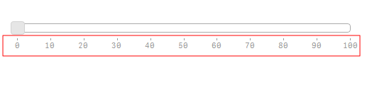
Ticks
The below listed properties can be used to define the behavior of the wiSlider's ticks.
| Property | Description |
|---|---|
ticks |
Enable or disable ticks. (Default: true) |
ticks-first |
Behavior of the first tick. Possible Values: false - First tick is not shown.label - The tick and the label will be rendered.tick - Only the tick will be rendered. |
ticks-last |
Behavior of the last tick. |
ticks-rest |
Behavior of all ticks except the first and last one. |
ticks-labels |
Define the labels shown as array. Disable by leaving blank or setting tick-labels="false"Example: tick-labels="['Jan','Feb','Mar','Apr','May','Jun','Jul','Aug','Sep','Oct','Sep','Oct','Nov','Dec']"(Default: false) |
ticks-suffix |
Suffix for the tick, e.g. " USD".(Default: blank) |
ticks-prefix |
Prefix for the tick, e.g. "$ ".(Default: blank) |
ticks-step |
Numeric value to define the relative steps for the ticks, related ot the steps defined from the wiSlider steps. If step 1 is defined, for every step in the step property of wiSlider a tick will be rendered.(Default: blank) |
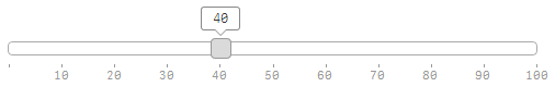
Hints
Use the below listed properties to influence the behavior of the hints when the user activates the slider:
| Property | Description |
|---|---|
hints |
Enable for disable hints. (Default: true) |
Initial Value(s)
- If Qlik Sense variables are defined (either
bind-qsfor a single value slider orbind-qs-minandbind-qs-maxfor range sliders), the values of these Qlik Sense variables will also be the initial values for the slider - Otherwise a best-guess default value will be chosen.
Style Modifications
The implementation of wiSlider is based on the jQuery UI Slider. If you want to modify the style of the slider, add the following CSS definition to your qWidget:
Css:
/* Default style */
.wiSlider .ui-state-default {
    border-color:blue;
    background:lightblue;
}

/* Style when hovering a slider */
.wiSlider .ui-state-hover {
    background:darkblue;
}

/* Style when changing a slider */
.wiSlider .ui-state-active {
    background: red;
}
Examples
Single Value Slider
<wi-slider
    min="0"
    max="100"
    step="10"
    bind-qs-var="vSliderResult"
    >
</wi-slider>
Range Slider
<wi-slider
    min="0"
    max="100"
    step="10"
    range="true"
    bind-qs-var-min="vSliderResultMin"
    bind-qs-var-max="vSliderResultMax
    >
</wi-slider>
Vertical Slider
<wi-slider
    min="0"
    max="100"
    step="10"
    orientation="vertical"
    bind-qs-var="vSliderResult"
    >
</wi-slider>
Set Height of a Vertical Slider
Use the inline style to define the height of a vertical slider. Note: In the sense of responsiveness this is not an ideal solution!!!
<wi-slider
    min="0"
    max="100"
    range="true"
    step="10"
    orientation="vertical"

    ticks="true"
    ticks-first="label"
    ticks-last="label"
    ticks-rest="label"
    ticks-step="5"

    bind-qs-var-min="vSliderResultMin"
    bind-qs-var-max="vSliderResultMax

    style="height:300px"

    >
</wi-slider>
Slider Using Decimal Values
Not supported, yet.
Targeting Qlik Sense Variables
<wi-slider
    min="0"
    max="100"
    step="10"
    range="true"
    bind-qs-var-min="vSliderResultMin"
    bind-qs-var-max="vSliderResultMax
    >
</wi-slider>
Working with Local Variables
<wi-slider
    min="0"
    max="100"
    step="10"
    range="true"
    bind-local-min="sliderMin"
    bind-local-max="sliderMax
    >
</wi-slider>
Modified Style
Known Issues
- Smaller rendering issues:
- If you maximize the wiSlider, initially the hints will not be rendered correctly
- The wiSlider is regarding its rendering sometimes not fully responsive
- If variables are updated (in the QIX Engine), wiSlider doesn't get updated automatically
- Hints are disabled if
orientationis set tovertical - Fixed sized vertical sliders are not responsive at all.
Future Improvements
- Support for decimal numbers.
Appendix
How to Define Variables ?
As of Qlik Sense 1.0 you can create variables only in the load script:
// Use only integer values as of now !
SET vVariableName = 155;