Button Group Component
wiButtongroup allows you to define Boostrap styled button-groups with single- or multiple-selections. If the user changes the selection, the result will be stored in a Qlik Sense variable.
Basic Example
Html:
<wi-buttongroup bind-qs-var="vOpt1">
    <wi-radio-button label="First" value="'first'"></wi-radio-button>
    <wi-radio-button label="Second" value="'second'"></wi-radio-button>
    <wi-radio-button label="Third" value="'third'"></wi-radio-button>
</wi-buttongroup>
Result:
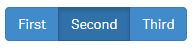
The user can only select one of the buttons at the same time (like a Radio-Button), the result ('first', 'second' or 'third') will be stored to the Qlik Sense variable vOpt1.
vOpt1 also defines the initial value of the button-group.
Properties
Buttongroup The button-group is the container which holds either check-buttons or radio-buttons (don't mix check- and radio-buttons within a button-group).
bind-qs-var
The name of the variable the button should be bound to.
(Only applicable if you use wiRadiobuttons).
Radio-Buttons and CheckButtons These properties are available for both Radio-Buttons and Check-Buttons.
label
Label of the button.value
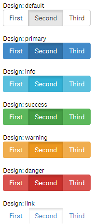
Value which will be stored to the defined variable if the button is selected.design
Default style for the button.
Possible values aredefault,primary,info,success,warning,danger,link.
(Defaults:default)
Check-Buttons
bind-qs-var
Name of the variable the button should be bound to.
Designs
Depending on the property design a (according to the pre-defined styles of Bootstrap) design will be applied:
Custom Styles
Custom styles can be defined as follows:
First instead of using one of the predefined design, define "custom" in the property design:
<wi-check-button design="custom" ... />By doing so the class btn-custom will be added to the button which can then be defined:
/* Default Style */
.btn-custom {
    background-color:#ccc;
    color:#333;
}
/* Hover Style */
.btn-custom:hover {
    color:#666;
}
/* Style for active/pressed button */
.btn-custom.active {
    background-color:#999;
    color:#efefef;
}
Result:
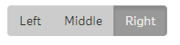
Full Code:
<wi-buttongroup>
    <wi-check-button design="custom" value="left" label="Left" bind-qs-var="vOpt1"/>
    <wi-check-button design="custom" value="middle" label="Middle" bind-qs-var="vOpt2" />
    <wi-check-button design="custom" value="right" label="Right" bind-qs-var="vOpt3" />
</wi-buttongroup>