Progressbar Component
The wiProgressbar component has been created by leveraging the progressbar component of Boostrap: http://getbootstrap.com/components/#progress
Bootstrap style-definitions will be added automatically if you use wi-progressbar.
Basic Example
Html:
<wi-progressbar max="100" value="50">50%</wi-progressbar>Result:

Properties
wi-progressbar is only available as an Html-element not as an attribute.
max
A number that specifies the total value of bars that is required.
(Default: 100)value
The current value of progress completed.type
Style type. Possible values areprimary,info,success,warning,danger,inverse
(Default: null)animate
Whether bars use transitions to achieve the width change.
(Default: true)
Example Using All Properties
<wi-progressbar
    max="100"
    value="50"
    animate="true"
    type="danger">50%
</wi-progressbar>
Stacked Progressbar
If you want to add multiple bars into the same progressbar you can create a stacked progessbar:
Basic Example
Html:
<wi-progressbar>
    <progress>
        <bar value="20" type="danger">20%</bar>
        <bar value="10" type="success">10%</bar>
        <bar value="60" type="info">60%</bar>
    </progress>
</wi-progressbar>
Result:

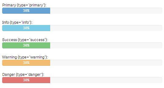
Examples
Types
Examples how a progressbar would look like depending on the chosen type:
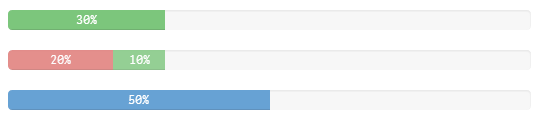
Multiple Progressbars in a Single qWidget
Html:
<!--
    Property definition for this example:
    ~~
    layout.property1: 100
    layout.property2: 30

    layout.property3: 20
    layout.property4: 10

    layout.property5: 50
-->
<wi-bootstrap>
    <div class="container-fluid">
        <div class="row">
            <wi-progressbar
                max="layout.property1"
                value="layout.property2"
                type="success">{{layout.property2}}%
            </wi-progressbar>
        </div>
        <div class="row">
            <wi-progressbar>
                <progress>
                    <bar value="layout.property3" type="danger">{{layout.property3}}%</bar>
                    <bar value="layout.property4" type="success">{{layout.property4}}%</bar>
                </progress>
            </wi-progressbar>
        </div>
        <div class="row">
            <wi-progressbar
                max="100"
                value="layout.property5">{{layout.property5}}%
            </wi-progressbar>
        </div>
    </div>
</wi-bootstrap>
Result: